GearMonster Introduction & Roadmap
GearMonster is a pet project at AppFoundry… it is a case for continuous research & development and evaluation of our software factory for Android.
TL;DR: GearMonster is an Android app for stompbox aficionados - get it via gearmonster.appfoundry.be
Rationale
At AppFoundry we continuously invest in research and revision of our project setup and tooling. Libraries, frameworks, patterns, build configurations, CI, CD, automated testing and instrumentation, platform-specific UX and UI design patterns and guidelines, … the whole shebang… A real project is a great opportunity to try out new things and learn. The proof of the proverbial pudding is in the eating, as we tend to say. (But we never say it like that per se…)
Concept
The app is crafted for a very specific persona… to be precise:
The stompbox-lovin-gear-acquisition-syndrome-suffering-musician*
What… gear… exactly?
For the non-guitarist: an effector, effect pedal or stompbox are synonyms.
Effects units are electronic devices that alter how a musical instrument or other audio source sounds. Some effects subtly “color” a sound, while others transform it dramatically. Effects are used during live performances or in the studio, typically with electric guitar, keyboard and bass. While most frequently used with electric or electronic instruments, effects can also be used with acoustic instruments, drums and vocals. Examples of common effects units include wah-wah pedals, fuzzboxes and reverb units.
Source: Wikipedia
You can also view this enlightening, thought-provoking, informative video on the subject of guitar effects.
The Main User Story
As a gear-addict* i want to keep a list of effectors and store their configurations.
Very Quick Functional Requirement Specification
- Manage collection of effect pedals, wishlist, diy-todo-list…
- Group pedals (pedalboard, studio, …)
- Add notes, a picture, rating, …
- Store the effectors’ parameter settings for reference
Similar Apps
Actually, there are very little apps we could find that offer this. (For Android, if you can find any, let us know…)
BOSS / Roland Corp made an app called Pedal Sketch for iOS/iPhone that is actually not too shabby (at all!), but was sadly discontinued and is for Boss compact pedals only. It can still be found on the iTunes Store
Development
For a R&D project like this, the client is… well… us.
And as it happens - not surprisingly - some of us are familiar with the persona described above*. Some others of us are totally unfamiliar with the subject matter, but have a lot of experience with chickens, which has proved to be extremely useful when testing the app…
Project Setup
Technically, the app makes use of quite a few open source libraries and tools:
- Mosby Model-View-Presenter Utils
- Dagger 2 Dependency Injection
- Sugar ORM
- RxJava + RxAndroid
- ButterKnife, Icepick, Process Phoenix
- Timber, LeakCanary, Fabric, Mockito, etc.
Our app architecture and build setup for Android has similarities with the one we use for iOS and we have a series of articles on what this entails.
Team Dynamics
We’re using Slack for dev-related chit-chat, it keeps the conversation going with the whole Android team. This often speeds up troubleshooting by the amount of combined experience at hand.
Tools like BitBucket, JIRA, Confluence, Fisheye+Crucible make it very easy to keep track of bugs, new features, improvements etc. Someone wants to add a feature for himself - creates a feature branch. Refactor or improve the codebase, use a different library or version - same thing. Peer code reviews - check.
It creates a dynamic everyone benefits from. (Importantly - there are no obligations.)
Roadmap

In October 2015 we’re getting near the end of phase one - the “Minimal Viable Product” phase that started during the summer of 2015 - with the sign-up for early access and first private beta.
We could have approached the MVP from the angle of making the app minimal - eg. take one feature and make it awesome at that one thing. Instead, we put all the initial features in, at least with a minimal user-interface, in order to see if it is a valid product.

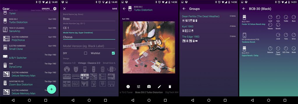
Version 0.4.2 Screenshots
In the second phase (starting with a public beta for version 0.5 and preceding what might someday be publicly released as a true 1.0 product) we’re going to revise, remodel, redesign, refactor, recycle, etc.
Improve. Polish.
And we’ll see where we end up… not committing to any release date at this point…
Interlude about the gear icons
Keeping a list of your pedals without a matching icon is pretty boring. So it would be nice to provide a number of icons the user can pick, right? If you would like to get an idea of the plethora of effect pedals in existence, there is an online database that has most of them… A quick count? More than 20000…
Obviously, that’s not feasible.
Retro-cool
Personally, growing up with the ZX Spectrum, BBC Micro and a Commodore PC-1, my weapon of choice is low-res pixel art. A visual language that is considered very old school by those young retina-eyed hipster kids nowadays, yet one that is still used for LCD-based GUIs (here and here for example). This allowed me to produce over 300 icons for the most popular and common form-factors (and a few vintage designs thrown in for good measure) in a reasonable amount of time. (These would actually be directly usable for the Atari 2600 port…)

A subset of 256 included icons at 24x24 pixels
Pixeldensitycrispness
This approach also comes with a caveat… you don’t want your crispy pixels get all smeared due to density-independent pixel subsampling. (Oh no, the horror!)
Android is a wee bit more challenging when it comes to dpi compared to, say, a GameBoy or an iOS device.
To recap, screen densities are categorised and mapped to bitmap (drawable) resources as follows:

Our requirements for the icons are:
- between 16dp and 24dp for the small size and double that for the large size (32dp to 48dp)
- support hdpi+
- crispy pixels! 1-bit per pixel! no aliasing!
The icons are drawn 1:1, and then scaled up x2, x3, x4 etc. to generate the resources for different pixel densities. Crispy pixels don’t take fractions and that means if we would use the ratios, our icons would only look good in hdpi and xxhdpi.

If we round the ratios to crispy-friendly integers this means that our icons will have a different dp size depending on the screen density.

That may sound like a nightmare to keep your UI consistent across screens, but this trade-off actually works pretty good…
Epilogue
We’re having fun with this app! It makes a good case study for our development guidelines and we’re improving our bag of tricks.
Be sure to follow @gearmonsterapp on Twitter and join the Google Group for prerelease access and discussion.
